Web Design Trends 2025 | Balancing AI and Human Craft
As a Squarespace designer, I'm constantly exploring innovative approaches to web design and effective visual communication. In this post, I'll highlight 8 emerging web design trends we're likely to see in 2025 - from immersive video experiences and AI integration to hand-drawn aesthetics. While some may be temporary, many reflect broader cultural and technological shifts. Here’s 8 trends shaping the future of web design in 2025. Let’s get started.
1. The Rise of Video: Immersive Storytelling
Video has become an increasingly powerful tool for web design, allowing businesses to showcase their products and immerse visitors in unique experiences. As bandwidth capabilities improve and video editing tools become more accessible, we're seeing a surge in the use of high-quality video content on websites.
One standout example of this trend is the surf travel site Thermal. The website immediately captivates visitors with a full-screen video background featuring stunning footage of surfers riding waves in beautiful locations. This immersive approach not only showcases the product (surf travel experiences) but also instantly transports the viewer to these dream destinations.
Another great example comes from Graza, whose website showcases their innovative squeezable bottle design with a compelling header video. This video cycles through people cooking casual meals with beautiful ingredients, effectively communicating Graza's commitment to quality and approachable luxury, reinforcing their unique place in the market. Creating a thoughtfully crafted website also helps instill in customers.
The rise of user-friendly video editing tools like Veed.io, Canva, and Descript has made it easier than ever for businesses to create and incorporate professional-looking video content into their websites. This democratization of video production means that even small businesses and individuals can leverage the power of video to tell their stories and engage their audiences.
By crafting a website that is both visually inviting and user friendly, companies can effectively communicate that their dedication to quality extends far beyond their digital presence. This level of care in web design subtly yet powerfully suggests that every aspect of their product and customer interaction has been carefully considered and refined.
As we move towards 2025, expect to see more websites utilizing video in web design and across social channels in creative ways, such as:
Interactive video backgrounds
Video based tutorials
Behind-the-scenes glimpses into company culture
Customer testimonials and success stories
2. Scrollytelling: Crafting Compelling Narratives
In an era where AI-generated content is becoming increasingly prevalent, the ability to create a compelling narrative is more crucial than ever. Enter scrollytelling – a technique that combines scrolling with storytelling to create rich, engaging user experiences.
A prime example of effective scrollytelling is the website for HPQ Frankfurt. As users scroll down the page, they're taken on a journey through the company's history, values, and services. This approach keeps users engaged and curious about what comes next. This is especially effective for items like real estate or products with a higher price tag. Leaning into scrollytelling is a great way to showcase your benefits and value without boring people with walls of text and technical jargon.
In my experience, scrollytelling is a great way to take longer from educational or research-based content and turn it into something engaging. Fundraising and public health campaigns can also greatly benefit from scrollytelling as people often need to learn about a cause and feel invested before they are ready to take action.
Scrollytelling allows businesses to:
Break down complex information into digestible chunks
Guide users through a narrative in a controlled, sequential manner
Incorporate interactive elements that respond to user scrolling
Create memorable, shareable experiences that stand out from the competition
As we approach 2025, expect to see more websites embracing scrollytelling techniques to create unique, narrative-driven user experiences.
3. Tactile Digital Experiences: Bringing Texture to the Screen
As digital experiences become increasingly sophisticated, designers are finding ways to make websites feel more tactile and three-dimensional. This trend involves incorporating elements that appear squishy, fuzzy, plush, or balloon-like, adding a sense of depth and interactivity to the digital space.
Wanna This offers a collection of abstract 3D illustrations that exemplify this trend. These designs feature soft, pillowy shapes and textures that almost beg to be touched, even though they exist only on screen.
Design agency And Human takes this concept further by incorporating 3D balloon animals and liquid-like textures in their header section. This playful approach not only catches the eye but also makes the digital experience feel more tangible and memorable.
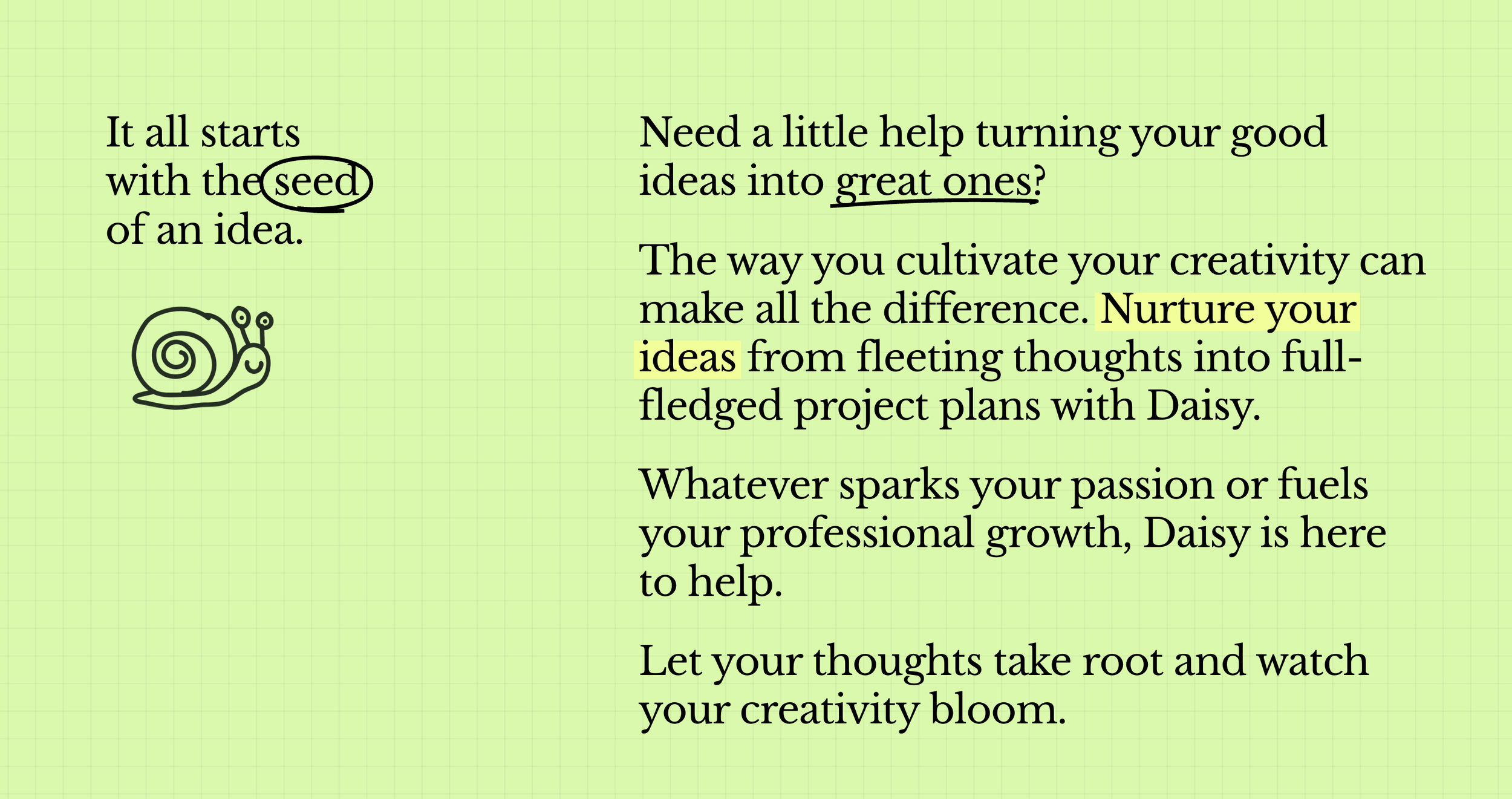
Daisy, an AI Collaborator for creators, soloprenuers, marketers and small business.
Daisy, an AI collaborator for creatives, small businesses and soloprenuers features a scrapbook aesthetic with tacticle 3d images that feature easter eggs when you scroll over them.
As we move towards 2025, expect to see more websites incorporating:
Soft, squishy 3D elements that respond to user interaction
Textures that mimic real-world materials like fabric, fur, or liquid
Micro-interactions that add depth and dimension to flat designs
4. Sustainability Meets Tech: Earthy Hues and Neon Accents
As environmental concerns continue to shape consumer preferences, we're seeing a trend in web design that juxtaposes sustainable values with cutting-edge technology. This is often expressed through color palettes that combine earthy, natural hues with vibrant neon accents.
Green Bioactives exemplifies this trend with a website that balances deep greens and browns with pops of neon green. This color scheme immediately communicates the company's focus on sustainable biotechnology.
Similarly, Wedgetail VC uses a palette of muted earth tones accented with bright yellow, creating a visual identity that feels both grounded and forward-thinking.
When discussing tech meeting a brighter future, we can't overlook Charli XCX's "Brat Summer" campaign. This project brilliantly embodies the fusion of technology and optimism, with its neon-infused aesthetics capturing the essence of a tech-driven, hopeful future. Charli's forward-thinking approach to pop music, characterized by boundary-pushing techy synths and futuristic production, further reinforces this theme.
In fact, it just so happens that Gen Z loves green and they are a big fan of contrasting colours. It would appear green is to Gen Z, as Pink is to millennials.
As stated by nsgclub.com:
“If there is a color capable of representing the values and culture of the Zeta Generation it is definitely green. Immediately associated with concerns about the environmental condition, the digital evolution and the hopes of a better future after the pandemic.”
5. Nostalgia with a Twist: Retro Meets Modern Playfulness
As we move into the future, there's a growing trend of looking to the past for inspiration. Websites are increasingly incorporating vintage aesthetics but with a modern, playful twist that keeps the design fresh and engaging.
Family Supper Club is a perfect example of this trend. The website features retro-inspired typography and color schemes that evoke a sense of nostalgia, but the overall design feels contemporary and fun.
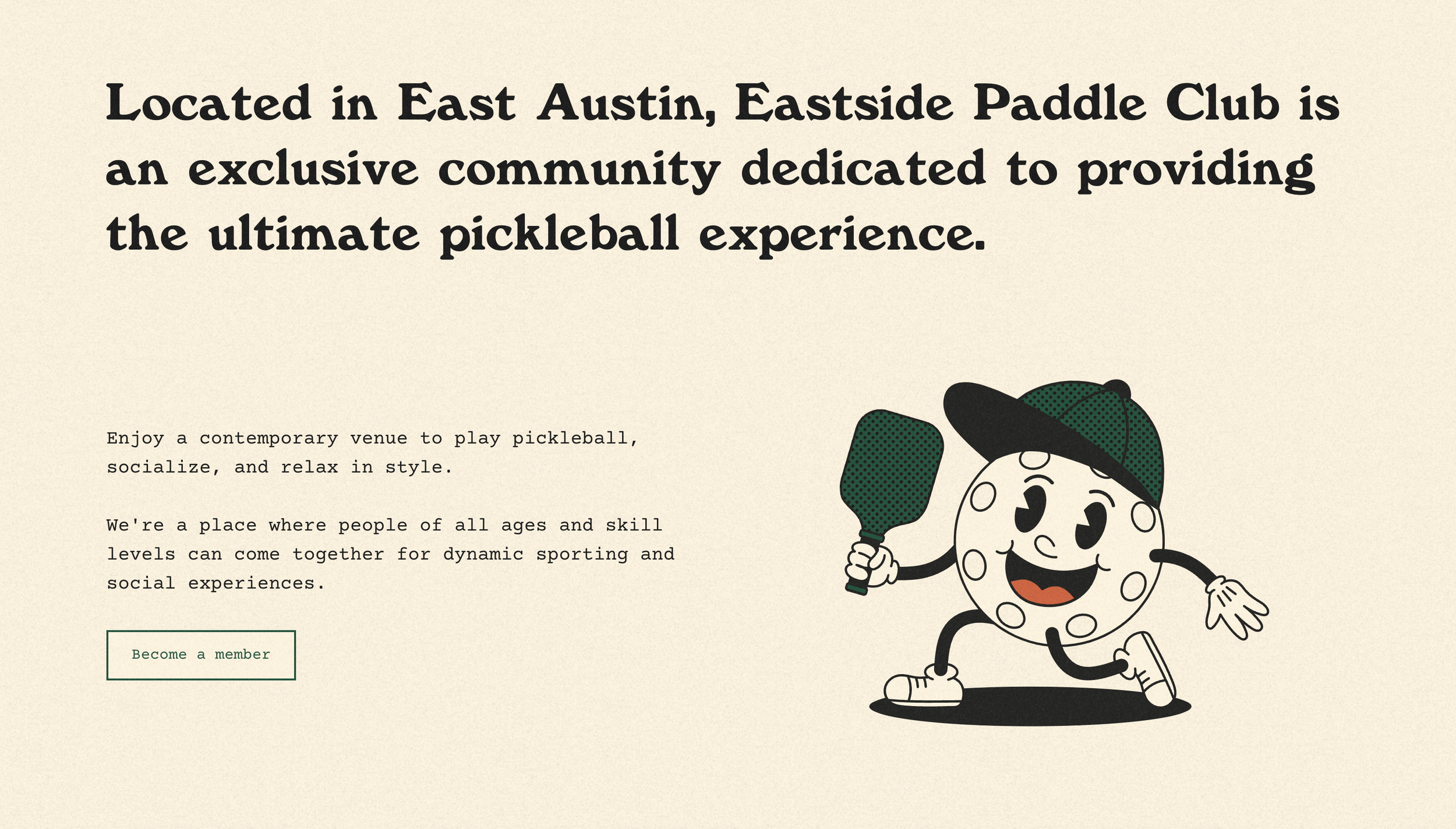
Another great example is Eastside Paddle Club, which combines vintage-inspired illustrations and retro fonts with modern layout techniques and interactive elements. The result is a website that feels both familiar and fresh.
As we approach 2025, expect to see more websites:
Reimagining retro design elements for the digital age
Combining vintage aesthetics with modern functionality
Balancing old-school charm with contemporary user experience design
6. AI-Driven Design: The Future of Website Creation & Planning
As we look towards 2025, it's clear that artificial intelligence will play an increasingly significant role in web design. AI is not just changing how we create websites, but also how we plan and strategize our online presence.
For website planning and strategy, tools like Cove AI offer a new way to approach research and content creation.
Popular design tools, Canva and Figma have both embraced AI, with features aimed to simplify creation, boost productivity, and enhance creativity, making design more accessible and efficient for users of all skill levels.
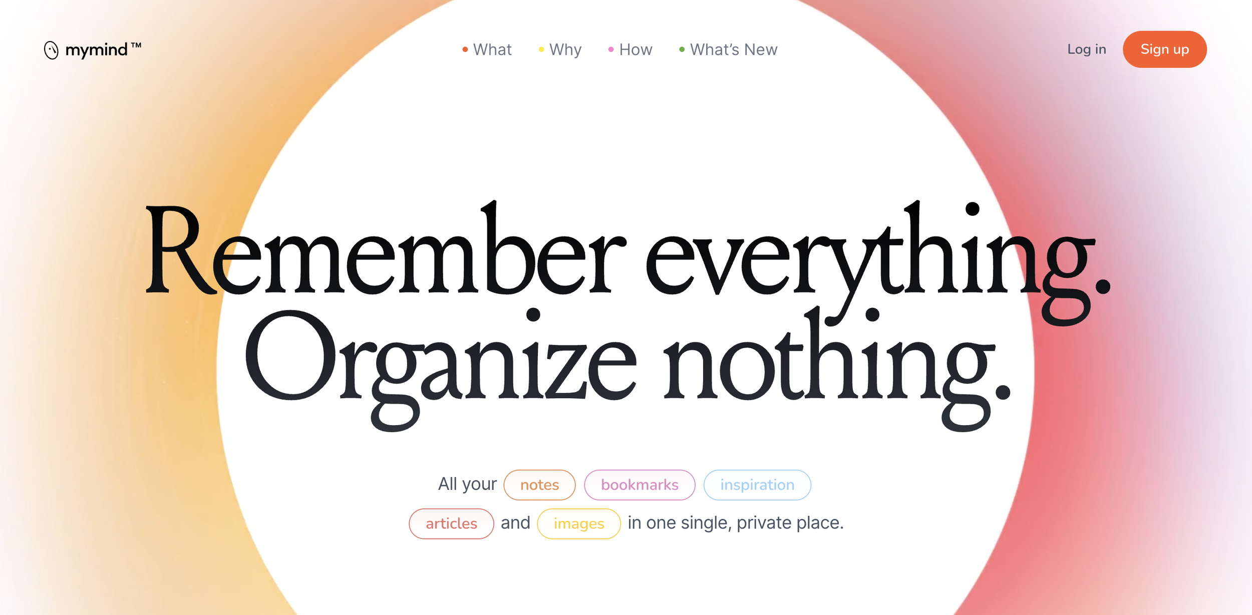
When it comes to collecting inspiration and planning content, MyMind leverages AI to help users organize and recall visual information. This tool can automatically tag and categorize saved images, making it easier for designers to find and use inspiration when they need it.
As we move towards 2025, expect to see:
More sophisticated AI-powered design tools that can generate entire websites structures based on prompting
AI assistants that can help with everything from colour selection to layout optimization
AI-driven content creation tools that can generate copy and visuals based on brand guidelines and target audience data
7. The Resurgence of 35mm Photography
With the rise of AI-generated imagery from platforms like MidJourney and DALL-E, people are craving the human touch in the craft. This yearning is evident on platforms like TikTok, where film photography has become an explosive trend. Designers can tap into this cultural movement by incorporating film aesthetics into their visuals, blending the old with the new. This approach can create a compelling narrative that resonates with audiences seeking authenticity and lasting value.
By leveraging the allure of film photography and combining it with contemporary design elements, designers can connect more deeply with their audience, offering a refreshing break from the ubiquitous, polished AI imagery.
source - https://unsplash.com/@sheasalisbury
In 2025, I think we can expect a resurgence in film photography or at least an effort to emulate its look and feel. As society reflects on fast fashion and consumerism, big brands will likely adopt photography that showcases a unique perspective, emphasizing that their products are built to last. This isn’t just about nostalgia; we’ll see an interesting blend, such as modern fonts and graphics paired with film photography.
8. Playful Hand-Drawn Illustrations in Modern Design
The Thermal website for Pablo Narvaez's Oaxaca adventure incorporates playful, hand-drawn style illustrations alongside its clean and immersive design. These illustrations add a personal, approachable touch to the sleek website layout. You can see examples of this in the icons used for "Pablo's Picks" section, showcasing simple, whimsical drawings, balancing the laid back adventurous spirit of surfing along with the professional and premium experience delivered by Thermal.
source: refettoriogeneva.org/en
Source: https://www.hidaisy.ai/
This trend of mixing hand-drawn elements with polished design is increasingly popular because it:
Adds warmth and personality to digital spaces
Creates a unique brand identity
Makes complex information more digestible and engaging
Provides a contrast to the perfectionism of digital design
Want to learn more? Take a listen to this conversation, presented in podcast format, discussing the future of web design in 2025.
[Disclaimer: Audio content is generated using AI voice technology based on my blog post, Top Web Design Trends 2025]
Conclusion
As we look towards 2025, it's clear that web design will continue to evolve in exciting and innovative ways. From immersive video experiences to AI-driven design tools, these trends represent the cutting edge of digital creativity. By embracing these emerging trends, designers and businesses can create websites that not only look stunning but also provide engaging, memorable experiences for their users.
Whether you're using Squarespace or another platform, keeping an eye on these trends can help you stay ahead of the curve and create websites that stand out in an increasingly crowded space. Remember, while trends come and go, the fundamental principles of good design – clarity, consistency, and user-centricity – will always remain relevant. As we move into this new era of web design, the key will be to balance innovation with usability, creating sites that are both visually striking and intuitively functional.


