Top 8 Squarespace Web Design Trends in 2024
Recent years have marked a shift from minimalist designs to more joyful and optimistic design trends, especially post-pandemic. The Barbie movie, emblematic of this shift, introduced the vibrant and playful "Barbiecore," trend which continues to influence design in 2024. These new trends offer a needed escape, promoting positivity, optimism, an emphasis on sustainability and balancing AI advancements with human craft.
In this post, we'll explore the top 8 Squarespace web design trends that are set to dominate 2024.
Visit the top web design trends for 2025 here.
1. Quirky, colourful and hopeful
There's a growing desire to infuse web design with optimism, hope, and unique perspectives. I anticipate a shift towards websites that are quirky, playful, and blend nostalgia with innovation, showcasing distinct personalities.
Circa, an upcoming website builder, exemplifies this trend. Unlike the corporate and uniform SaaS products of recent years (hello, Corporate Memphis), Circa promises a more playful and quirky approach.
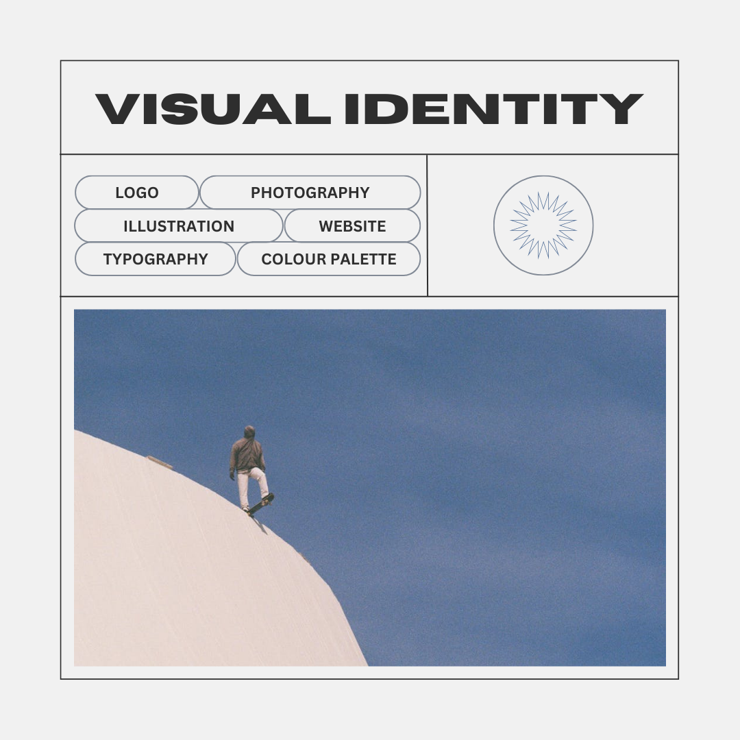
2. Film photography & unique artistic style
In 2024, we can expect a resurgence in film photography or at least an effort to emulate its look and feel. As society reflects on fast fashion and consumerism, big brands will likely adopt photography that showcases a unique perspective, emphasizing that their products are built to last. This isn’t just about nostalgia; we’ll see an interesting blend, such as modern fonts and graphics paired with film photography.
With the rise of AI-generated imagery from platforms like MidJourney and DALL-E, people are craving the human touch in the craft. This yearning is evident on platforms like TikTok, where film photography has become an explosive trend. Designers can tap into this cultural movement by incorporating film aesthetics into their visuals, blending the old with the new. This approach can create a compelling narrative that resonates with audiences seeking authenticity and lasting value.
By leveraging the allure of film photography and combining it with contemporary design elements, designers can connect more deeply with their audience, offering a refreshing break from the ubiquitous, polished AI imagery.
3. Claymorphism in web design
Claymorphism is indeed a significant component that is showing up in web design. It involves the use of clay-like textures and soft, voluminous shapes in digital design. This technique aims to mimic the playful and malleable nature of clay, creating a visually appealing aesthetic. By incorporating claymorphism, designers can evoke a sense of tactility and three-dimensionality in their designs, making them appear more inviting and interactive.
4. Emotionally resonating through scrollytelling
So, what exactly is scrollytelling? It’s about rethinking how you display your content to make it more engaging. While traditional scrolling can be tedious, scrollytelling aims to transform it into a magical experience.
Scrollytelling can effectively hold attention even for dry content. When done right, it’s amazing; when done poorly, it can be frustrating. In an era where AI-generated copy is proliferating, capturing the minds and hearts of potential customers through scrollytelling and authentic connection is more important than ever.
The example below really shows how scrollytelling can shine. HPQ Frankfurt does a great job of truly emerseing you in their product. The aren’t just focused on the facts and figures, but also on having their audience emotionally resonate with their offerings.
With the emergence of a cookieless web, I anticipate we will see more experiences like this. While there will be a website with the goal of purchase, or conversion, I think we will see a lot of secondary ecosystems cropping up to tell a story, share values, and emotionally resonate and connect with people.
Scrollytelling for education, research and fundraising campaigns
In my experience, scrollytelling is a great way to take longer from educational or research-based content and turn it into something engaging. For many industries, their product or service may be a bit complicated, or confusing and scrollytelling offers a solution to keep people interested and gain a deeper understanding. Fundraising campaigns can also greatly benefit from scrollytelling as people often need to learn about a cause and feel invested before they are ready to take action.
5. 70’s and 80’s typography and graphics
Typography is playing a huge role in 2023 web design aesthetics, adding to the overall sense of playfulness and approachability. Several successful brands, such as Airbnb, Dropbox, and Slack, have effectively used nostalgic typography to capture the establish relatable and approachable brand identities.
We will continue to see an emphasis on bold, oversized, vibrant, and nostalgic letterforms. Designers will push boundaries by experimenting with oversized typography and exploring the creative potential of overlapping elements, resulting in visually striking and attention-grabbing designs that harken back to the iconic styles of the past.
6. Print style illustrations
Illustrations are another significant element showing up in web design. These illustrations playfully depict simplifications of real-life objects and convey the essence of a brand's message. They range from cute and cuddly to odd and quirky, but one thing they all have in common is a sense of whimsy.
I think we will see more illustrations and graphics that borrow from print and deliver an aesthetic that mirrors this style showing up in web design in 2023 and beyond. In some cases, I think this style will be in opposition to the glossier 3D elements that are so popular now, but I also think we will see these elements in concert with some of those more polished elements. Look for vivid colours, risograph style textures, and imperfections.
7. Organic shapes and sustainability emphasis
We are currently seeing a rising trend of incorporating more organic textures in web design. This departure from the sleek designs of the past indicates a growing emphasis on creating a visual language that aligns with our collective desire to connect with nature and promote environmental responsibility.
By incorporating organic textures, web designers are able to evoke a sense of warmth, authenticity, and harmony with the natural world, resonating with users who are increasingly seeking a more holistic and eco-friendly digital experience.
Fortunately, this is a great new feature that Squraespace added more recently, giving designers a lot of flexibility to play with imagery unique styles, includig layering photos.
8. Neons and dopamine boosting colour palettes
Perhaps you’ve heard of dopamine dressing. Dopamine dressing is a fashion trend gaining momentum, characterized by vibrant, mood-boosting colours and playful textures. This trend embraces the philosophy that wearing bright and joyful hues can have a positive impact on our mood and overall well-being.
Dopamine colours have been gaining traction as a popular trend in web design. These vibrant hues, inspired by the neurotransmitter dopamine, evoke feelings of joy, excitement, and energy. By incorporating dopamine colours into web designs, designers aim to create visually stimulating experiences that captivate users and leave a lasting positive impression.
source: graza.com
This colour palette is a brilliant choice by Graza as it resonates with their key demographic - environmentally conscious, younger consumers. Not only have they been able to tap into grounding, comforting and calming vibes with the beige and green shades, but they have also created an eye catching and modern design by adding brighter, contrasting colours.
In fact, it just so happens that Gen Z loves green and they are a big fan of contrasting colours. It would appear green is to Gen Z, as Pink is to millennials.
As stated by nsgclub.com:
“If there is a color capable of representing the values and culture of the Zeta Generation it is definitely green. Immediately associated with concerns about the environmental condition, the digital evolution and the hopes of a better future after the pandemic.”
Source: bratgenerator.net
Colours have a unique ability to evoke emotions and shape our perceptions. The vibrant green colour featured on the cover of Charlie XCX’s "brat" album, often referred to as "slime green," has become a symbol of renewal and optimism. This distinctive hue, now prominent in the Kamala Harris campaign has firmly planted itself in the culture as we collectively strive and yearn for progress and a brighter future.
You can even create your own take on the album cover at bratgenerator.net
I love this example from milkjar.ca, a candle company that has expertly crafted a brand that exudes a warm, playful, and contemporary vibe. Their website showcases a wonderful blend of modern neons, a relaxed color palette, and delightful doodles, all strategically harmonized to create a cohesive and vibrant look. It's a brilliant demonstration of balancing modern aesthetics with a sense of fun and relaxation.
Tapping into emotions with web design
These design trends evoke a sense playfulness, hope and nostalgia, allowing people to feel at ease and emotionally engaged.
As we approach 2025, web design will focus on balancing AI advancements with human craftsmanship and real world elements. Storytelling and brand recognition will become increasingly important as more AI-generated content floods the market. By creating a unique and engaging experience, these design trends help brands stand out, fostering deeper user connections and lasting loyalty.
Looking to achieve some of these trending styles? Check out some of the top Squarespace Templates for 2024 or customize your website from scratch with Fluid Engine from Squarespace.


