Seven ways to set your Squarespace website up for success
New year, new website? Whether you are looking to build a new website this year or planning on optimizing your current one, there are a few key elements you’ll want to focus on to set your website up for success. With that said, let’s dive in.
1) Communicate clearly
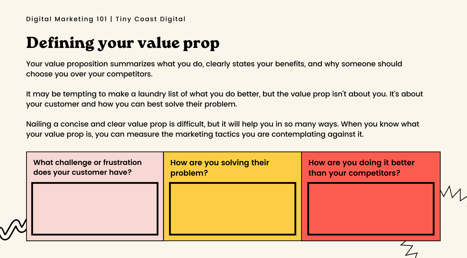
People should understand what your business offers within the blink of an eye. You have a tiny window of time to convey what you do and why someone should consider doing business with you. Visual design aside, a great way to do this is through an informative headline. This headline should be both clear and concise. If you are struggling to define your value prop, take a look at the worksheet below.
Beyond what is offer as a business, you will also want to be able to illustrate the benefits and value in your individual services, and products.
As obvious as this step is, it can often feel somewhat tedious and arduous. Often we know what we provide is valuable, but communicating that in a meaningful and clear way can be quite challenging. That said, communicating what you do clearly is a key component of setting your website (and corresponding marketing efforts) up for success in 2023.
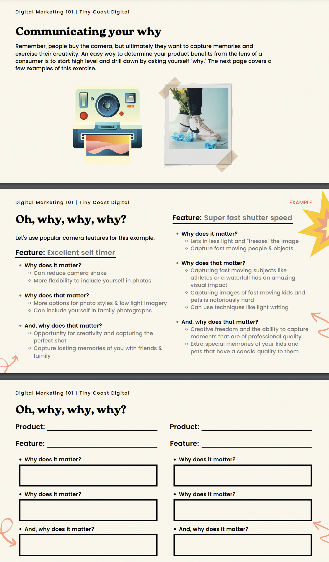
If you are struggling to convey why your product or services are valuable it is very helpful to drill down by asking “why?” a few times, as you will see in the exercise below.
Passing the blink test: Communicating your core service offerings and benefits
When someone arrives on your site, they should know what you do within the blink of an eye. Additionally, this information should appear above the fold. If someone arrives on your website and it takes them longer than 3 or so seconds to figure out what you’re offering and how you can alleviate their pain points, they are likely to go back to Google and search for your competitor.
2) Create valuable content
Your company's lengthy and long-winded history may feel like a necessary story to share, but is it valuable to someone trying to solve a problem or decide if we can assist them? If your story will help someone decide to work with or purchase you, by all means share it, but really evaluate if the content is more about you or your potential customer.
People can often fall into the trap of creating a lot of thin content - content with little value. Take a moment to consider your potential customers and how you can expand on and improve your content to provide valuable information. Would they benefit from something like a video tutorial, infographic, or detailed blog post?
Carefully consider your audience and content distribution
If you have valuable content, people will visit your site and trust it as a source of information. If you’re trying to create content for a blog, this means focusing on topics that will interest your readers. When creating content you will also want to consider content distribution.
If you are struggling to think about the kind of content that resonates with your audience, it may be valuable to dig into a buyer persona exercise. You want to know who your audience is so you can effectively speak their language, alleviate their pain points, create the kind of content they find valuable, and meet them on the digital channels they frequent.
Here are a few key questions you’ll want to ask yourself about your audience.
Use headings to organize your content
Headings can help improve user experience - people skim content, and headings allow them to find the information they are trying to access more efficiently. Additionally, heading tags can provide some hierarchical information to Google around the importance of your website content.
Using headings doesn't simply mean creating bold titles. Headings tags (h1, h2, h3, and so on) help Google spiders better understand your page's purpose. It is important to note headings should be used to improve user experience and not as a black hat SEO technique.
Don’t forget about calls to action.
Most importantly, include calls to action. Communicate the next steps clearly and make it easy for a visitor to take them.
Make sure the call-to-action (CTA) is clear, visible and easy to understand. Use language that appeals to the visitor's needs and interests. The more specific you can be about what it is you want the customer to do in response, the better your chances are of getting them to respond appropriately.
3) Focus on SEO and optimizing your content
Google doesn’t see a website the way humans do. Google is pretty brilliant, but it needs some helpful hints. The best way to provide those hints is to utilize on page SEO.
What we see:
What Google sees:
Google spiders are responsible for crawling your website and using the information we provide them when we build a website to return a search result when someone makes a google search.
Google wants to know the subject matter of your website. One fundamental way you tell it is by using H1 and H2 tags.
H1 and H2 tags are simple HTML tags that tell Google, “Hey Google, of all the content on this page, prioritize this - this is what my website is about. “
For example, people often fall into the trap of ignoring heading tags and relying on imagery. If you own a website selling baked goods with a heading (h1 tag) that reads, “you’ll love it here,” Google will likely have a hard time understanding what your business provides and consequently won’t serve it up in search results.
You want to provide emotional, appealing headings that appeal to humans while also providing keywords and HTML that help Google understand your website is an excellent fit to serve up when someone makes a search query.
Search engine optimization generally falls into on page, and off page SEO.
On-Page SEO: Potential customers want to achieve something like learning more about a topic, securing a service, or purchasing a product.
Google wants to provide the most helpful result for someone making a search query. Paying to drive traffic to your website can add up, so businesses often feel pretty motivated to improve their search engine ranking to gain more organic website traffic.
On-page SEO refers to optimizing your web pages for search engines and potential visitors to improve website visibility. On-page SEO includes content, keywords, heading tags, alt tags on photos, appropriate title tags, etc.
For an excellent article covering on-page SEO ranking factors, visit this article from Moz.
Off-Page SEO: When other websites promote you and link back to your website, be it due to great content you've created, sponsored content, or press releases, you gain backlinks. Backlinks, depending on the source, can suggest increased trustworthiness and quality of your content to Google.
However, ranking in search engines isn't about stuffing your website full of keywords or headings or gaining spammy links. It is about empathizing with a potential customer and considering how you can best solve their problem.
4) Design with empathy
In 2023, so much of marketing and web design is spammy and frankly intolerable. Good web design and smart marketing is about making the extra effort, care and consideration to understand your audience, and thoughtfully offer a solution to their problem or query.
Good web design is empathetic. A well designed website goes beyond having something current. At this stage in the game there are countless templates to choose from, and a huge supply of creative assets for purchase from brilliant designers. While I am a huge advocate for having a modern website, it is important to note that a trendy website isn’t always a well designed one. As with any form of design, you want to strike the balance between substance and style.
Google is increasingly putting more and more emphasis on user experience. To put it succinctly, you are more likely to show up in search engines if your website provides a good user experience. People generally come to your website to get something done. Google knows this and Google wants to provide the best possible result to people using their search engine. Consequently, you need to design your website to meet user needs.
Yes, there are a lot of tactics and best practices for growing your business, but at the heart of it, people want a considerate, trustworthy and authentic experience. Consumers are becoming increasingly weary of big data, and sneaky marketing tactics. People want to work with companies who put in the effort to provide a thoughtful and excellent experience.
When thinking about designing with empathy, it is crucial to have diversity and inclusion as a central focus. In 2022 there are really no excuses for failing when it comes to inclusive web design. From images and illustrations to web copy, there are a number of great resources to deliver a website that mirrors a diverse audience.
As an example, according to a 2022 Gallup poll, 1 in 5 Gen Z U.S. adults identify as LGBTQ+. What does this mean for web design? People want to see themselves seen and represented in marketing and design. If for example you’re a realtor, or any service provider for that matter, consider your visuals - are you assuming all of your clients are heterosexual? Moreover, consider you copy, use gender inclusive language and consider when certain information is really necessary.
Gender-inclusive language
Adding pronouns to the team section or about me section of your website is a great place to start. Check out Argo Collective to see this in action.
For a great example of gender inclusive copy, Mejuri illustrated pronouns done right in their International Women’s day Campaign. I was thrilled to see this from Mejuri, and it is my hope this will become best practice across the industry. For a beginner’s guide on Inclusive Design, visit this article from Career Foundry.
How can you create a diverse and inclusive website experience?
Make sure you use diverse photography. There are a lot of great options for diverse stock photos - two great sources are unsplash and pexles.
Use diverse illustrations. Blush by Pablo Stanley is a great source for diverse illustrations from incredibly talented artists.
Be mindful of gender inclusive language - consider assumptions of heterosexuality, pronouns, and what (e.g. webforms - do you really need someone’s gender?)
Hire diverse designers and marketers. The reality is that tech is largely made up of straight, cisgender, white men. If you want to champion diversity in design, hire diverse designers.
5. Have a solid visual identity
Your website is the most important aspect of your business. It is your storefront, and it’s where you can make or break a customer’s experience with your brand.
Your visual identity can help you stand out from the crowd and allows you to better communicate your message and align with your audience through visual elements like photography and illustrations, and colour palette.
Key components of your visual identity include:
Colour palette
Typography & font pairings
Icons
Illustrations
Photo styling
Logo & wordmark
It is important to remember that your visual identity should resonates with your target market. Moreover, as your audience evolves, your visual identity may need to as well. Perhaps your target market has stayed the same, but your visual update hasn’t changed in a number of years. Design trends come and go. What may have been hip and cutting edge a few years ago may no longer be working for you. It’s important that your brand is current to maintain credibility with your audience.
Visual Identity Example
More often than not, olive oil falls into that category of something a bit more polished or refined and can lend itself to the pretentiousness that comes along with a “luxury” product. Graza manages to cut right through that narrative and stand out with their playful and quirky illustrations.
Not only do these illustrations resonate with a younger audience (their key demographic), it is also a great way to convey information in a memorable manner.
Branche, another company offering olive oil, has also created an amazing visual identity. As you can see, theirs is more traditionally polished and elevated - perhaps more in line with what you’d expect to see from an olive oil company. These contrasting examples illustrate how visual identities for similar products can be designed to create a memorable experience and leave differing impressions on potential customers.
6) Pick the right website builder for you
Many years ago, websites were designed exclusively using HTML and CSS. This was often extremely cost-prohibitive and left clients relying on developers to make updates.
Today, new no-code tools such as Squarespace, Webflow, Wix, Editor X, and Framer are making it easier for organizations to build websites in record time, iterate to meet business goals, collaborate more efficiently and use their website as a true marketing tool.
Before picking a tool it is superlative that you think about your business goals, along with your resources to decide on the right platform for you. For many people, Squarespace is an excellent option with its wide breadth of features, as well as the launch of Fluid Engine, a drag-and-drop editor that allows for amazing designs. For other businesses, Webflow or Shopify may be more suited to their needs.
A website is one of your most important marketing tools, and if you intend on using it heavily to launch campaigns and corresponding landing pages, you’ll want to consider resources for running the website. For example, do you have a lean team that understands the tools? What is the learning curve like to get yourself up to speed on the platform?
You’ll also want to think about flexibility in terms of growth. You may intend to launch new services or try different business verticals over time. It is important to choose a web design platform that doesn’t require you to make costly adjustments or change platforms. When considering the right website platform for you, make sure to consider your long-term goals and if you are able to pivot within the platform. For example, within Squarespace, you can add e-commerce or membership functionality at a later date without having to rebuild your website.
7) Focus on your website goals
There are a lot of great website tools and templates out there. A beautiful website, however, isn’t enough to grow your business. Great web design finds the intersection between design and strategy.
When creating a website today, it is imperative to first consider your website goals.
While most designers take website goals into account, another component crucial to success will be understanding how you will use marketing to reach those goals. When web designers have a solid understanding of digital marketing, they can design a website that better meets your needs. If you are working with a number of stake holders, the core model developed by Ida Aelan is an excellent place to start.
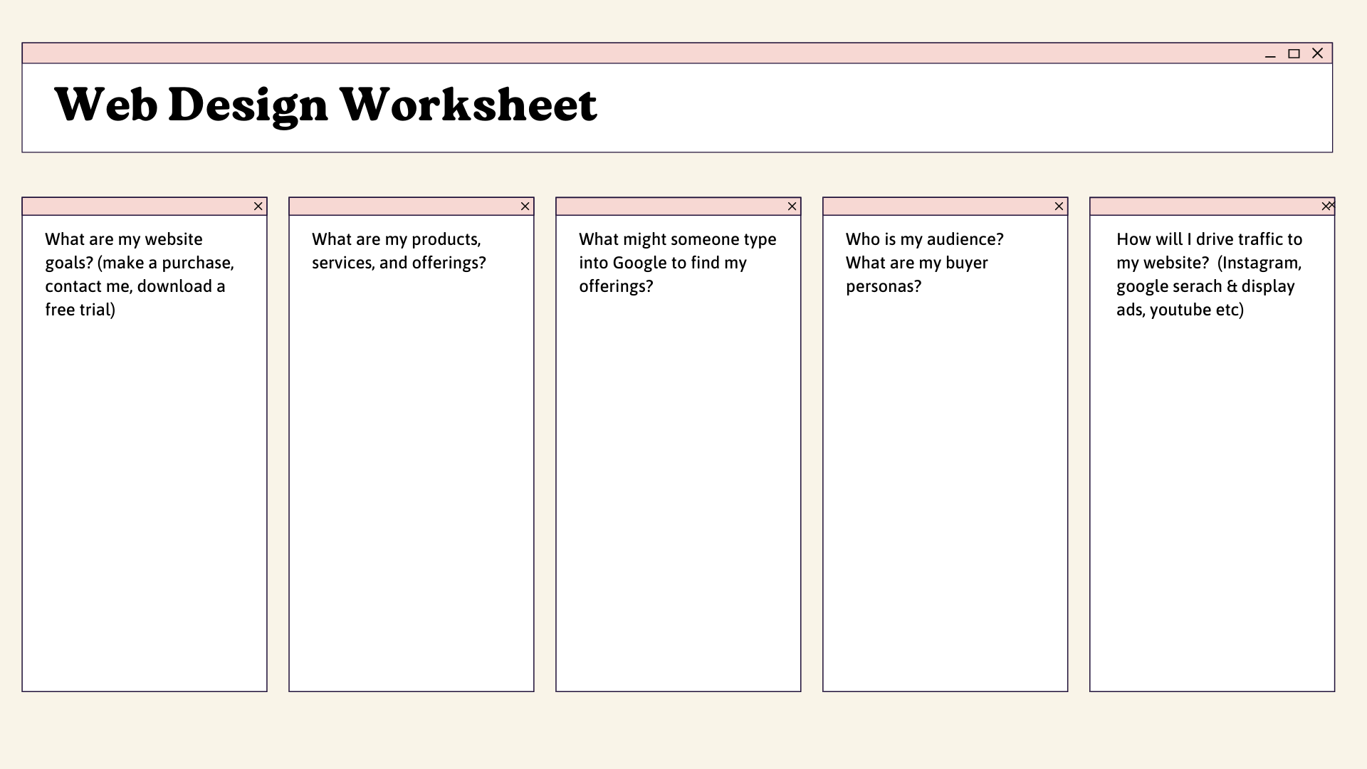
Good web designer consider target market, keywords you want to rank for, your current digital marketing landscape, how you will drive traffic, your cost per conversion, and intended ad spend.
Wishing you a successful year ahead! 🎉


